Character concept research, and progress of character design development.
The Character I decided to create is a tribal sorcerer/shaman. ‘A shaman is someone who is regarded as having access to, and influence in, the world of benevolent and malevolent spirits, who typically enters into a trance state during a ritual, and practices divination and healing.’
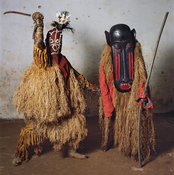
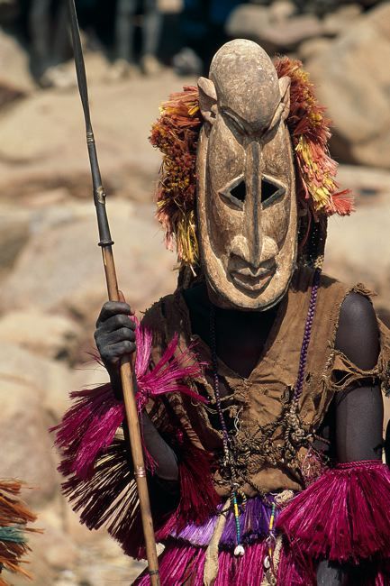
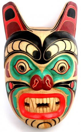
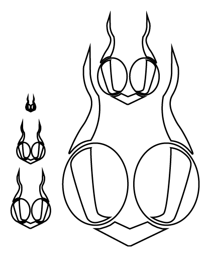
Mask
Cultures that use masks:
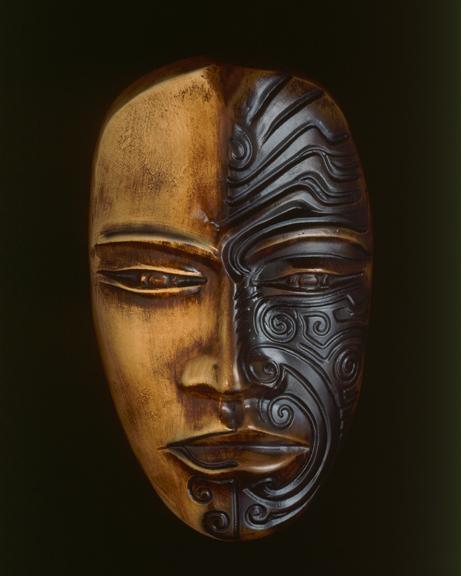
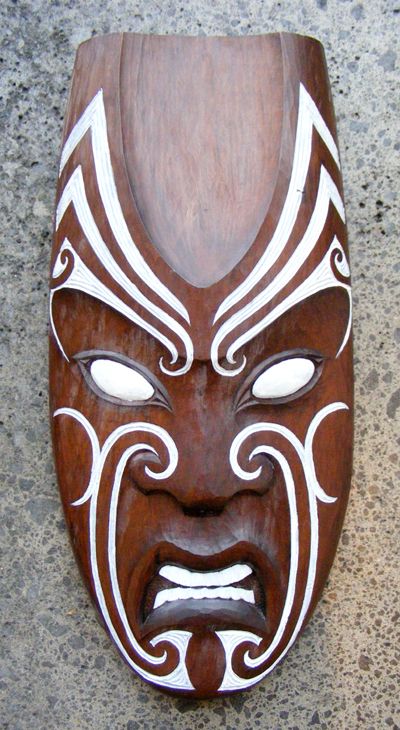
- Maori cultures use tiki masks
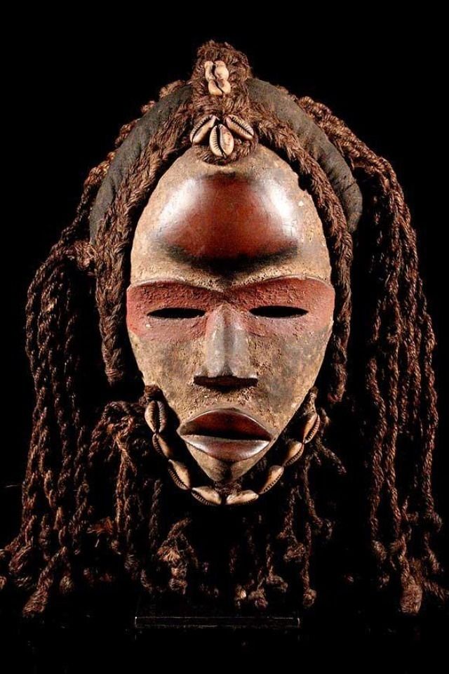
- African Tribes use ceremonial masks.
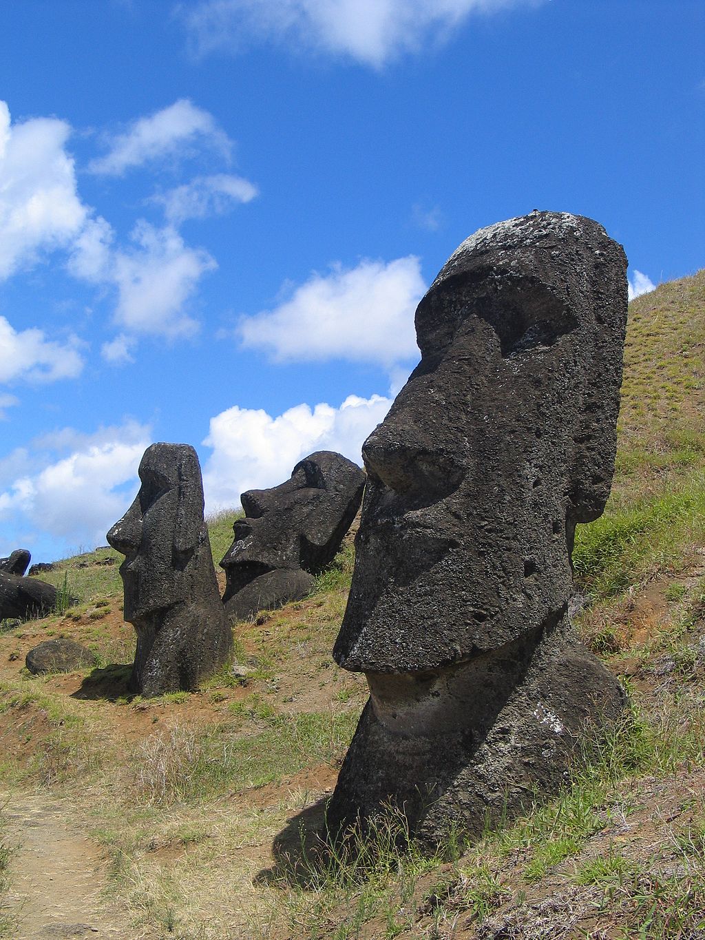
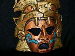
- Latin american aztecs used human skulls as masks
- Asia use highly exaggerated masks created from myths associated with the animal world and the divine to ward off evil.
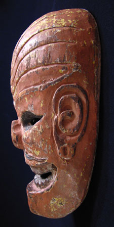

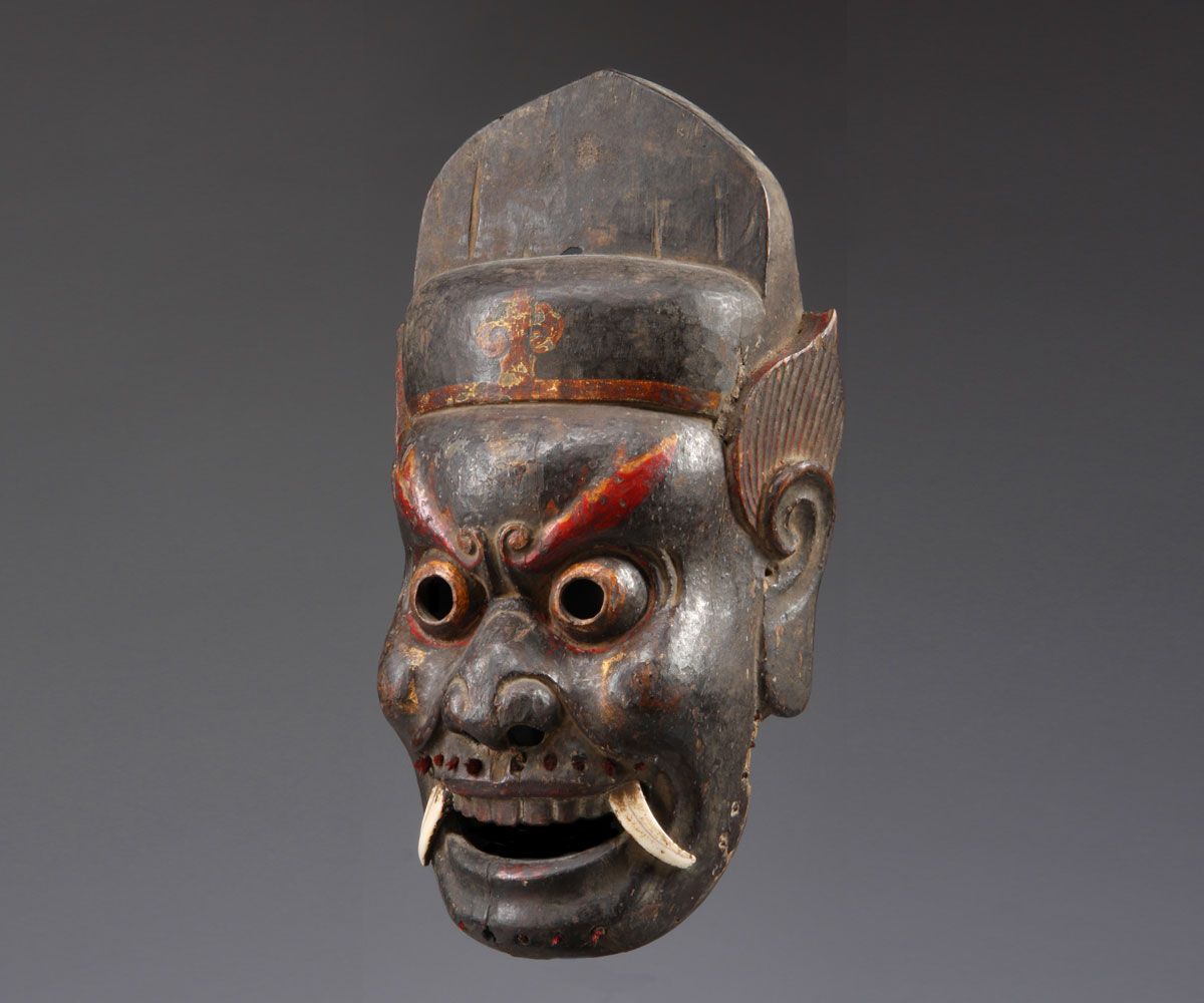
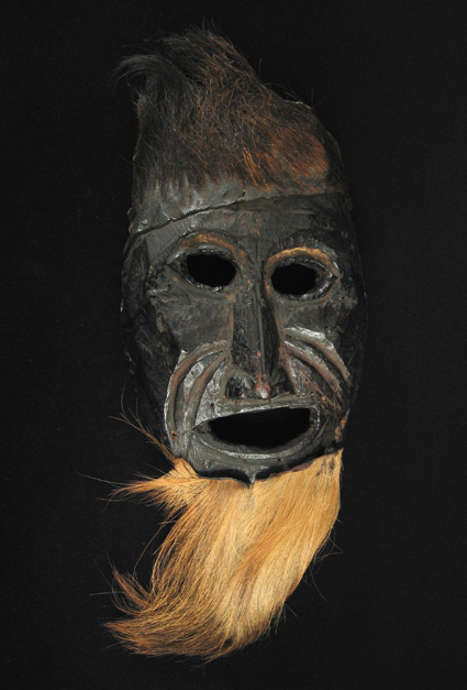
All of these cultures would have used masks for war or other reasons such as theatre, but I will be focusing on ceremonial masks to fit with my character.
After looking at all of these masks i decided to sketch a concept, this helped me to further the creative process. Pinpointing everything i still needed to research.
There is a lot of things I want to change and some that I am going to keep, and research more. I like the body shape, but after researching the aztecs i found that they typically had a stocky build. I’m going to keep the fact that he is holding a two handed polearm type weapon, although this is just a placeholder. The loincloth needs changing, as I want the character to show some culture with the clothing. I am also going to experiment with some other stances, although I do like the hunched over pose.
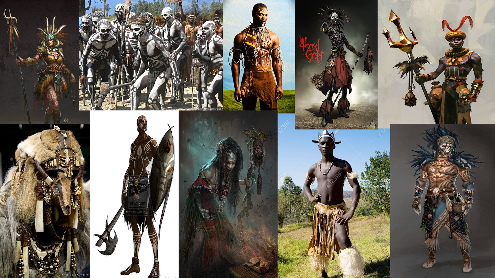
I decided to have a mix of aztec and african features when researching the clothing.
Useful information about the Aztecs:
The Aztecs believed in human and animal sacrifice. Often having willing participants in the ceremonies.
‘Aztec beliefs, Huitzilopochtli required regular nourishment (tlaxcaltiliztli) in the form of freshly harvested human hearts. As so-called “people of the sun,” the Aztecs were uniquely mandated to provide their patron deity with this bloody sustenance’.
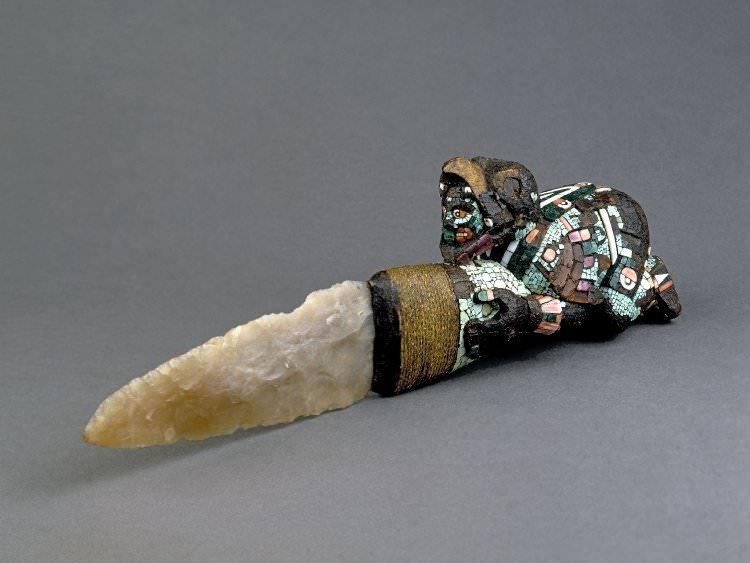
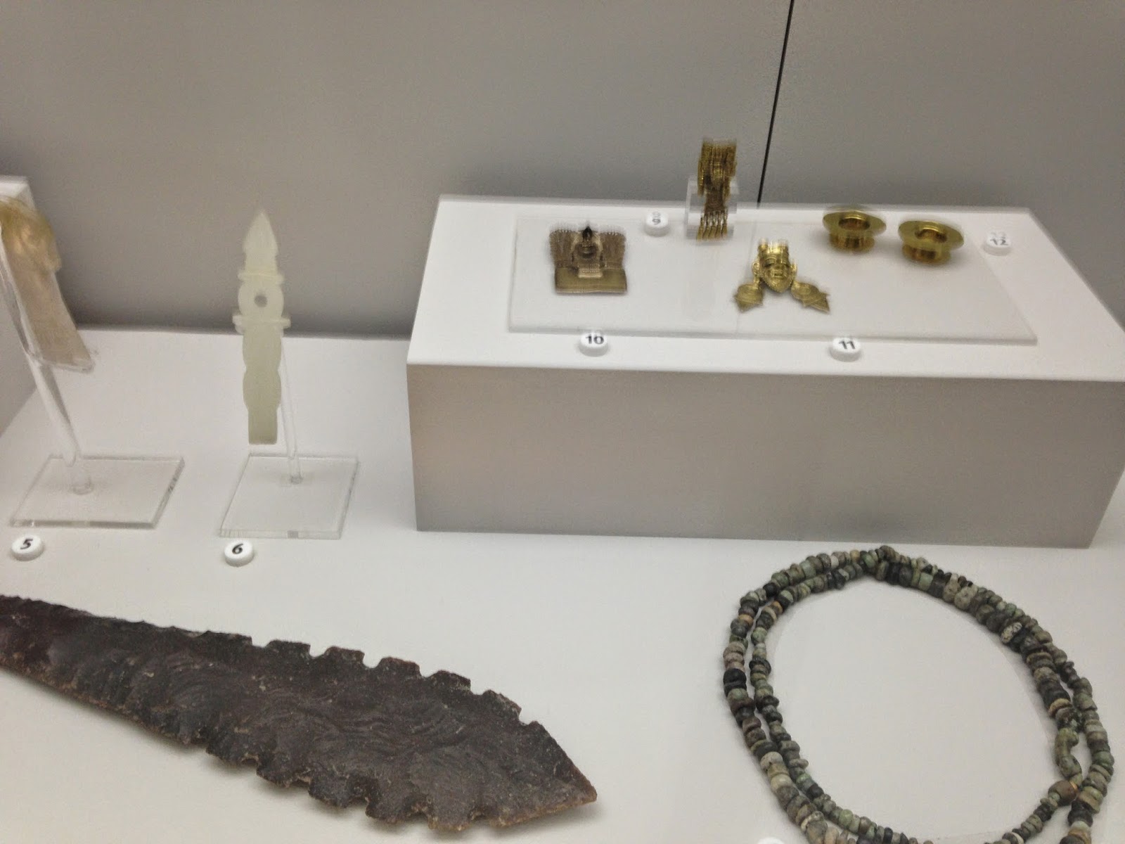
Aztec sacrificial knife.
The aztecs were quite short, usually no taller than 5 ft 6. The men had stocky builds. Body modifications were the norm. Having pierced lips, increasing the stretched hole depending on their battle skills. They also pushed the sides of children's head with wood and rope whilst the skull was still soft as to elongate the skull. Facial hair was removed as it was unfashionable to them. Hair would hang loose unless on festival days when it would be braided with ribbons

Aztec gods
Huitzilopochtli - Huitzilopochtli was the tribal deity of the Mexica and, as such, he represented the character of the Mexican people and was often identified with the sun at the zenith, and with warfare, who burned down towns and carried a fire-breathing dragon or serpent. He was considered the primary god of the south and a manifestation of the sun, and a counterpart of the black Tezcatlipoca, the primary god of the north, "a domain associated with Mictlan, the underworld of the dead."
Tlaloc (Classical Nahuatl: Tlāloc [ˈtɬaːlok])[1] was part of the pantheon of gods in Aztec religion. As supreme god of the rain, Tlaloc was also by extension a god of earthly fertility and of water.[2] He was widely worshipped as a beneficent giver of life and sustenance, but he was also feared for his ability to send hail, thunder, and lightning, and for being the lord of the powerful element of water. Tlaloc is also associated with caves, springs, and mountains, most specifically the sacred mountain in which he was believed to reside. His animal forms include herons and water-dwelling creatures such as amphibians, snails, and possibly sea creatures, particularly shellfish.[3] The Mexican marigold, Tagetes lucida, known to the Aztecs as yauhtli, was another important symbol of the god, and was burned as a ritual incense in native religious ceremonies.
Nobles dressed in brightly coloured cotton clothes decorated in gold and feathers. This was done to attract attention to themselves. The poor wore clothes made of maguey fibres, and slaves did not wear much at all!
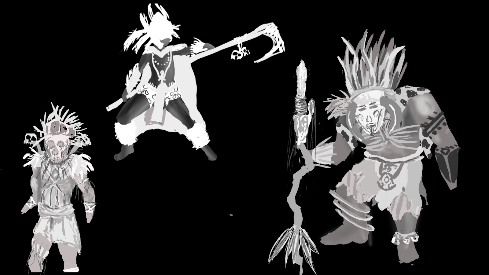
I decided to create some black and white drawings, experimenting with different body types and some costume designs. I then chose some aspects that i liked and the ones I didn’t. Creating these black and white images allowed me to focus on the overall image rather than the details. After this I was ready to create my final concept.

When creating my final design I kept a few mood boards open on my other monitor to make sure that everything I added had a purpose and a reason. I used my reference so that i didn’t make things up that wouldn’t work for the character. 
Aztec mask materials:
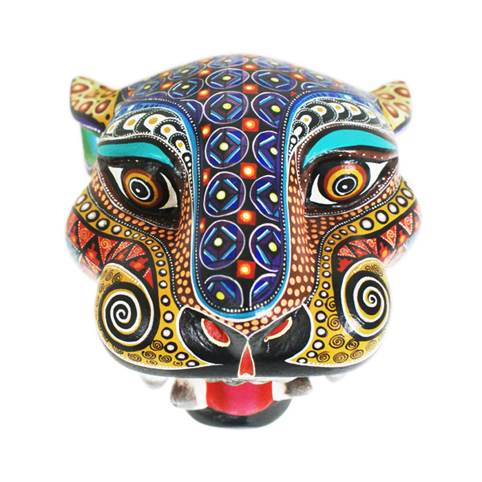
Sometimes masks were covered in mosaics made of various materials. The mask itself could be made of green or black stone, wood, obsidian (a hard dark volcanic glass/stone), or even placed on a real human skull.
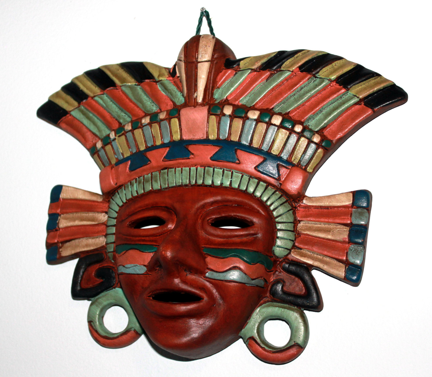
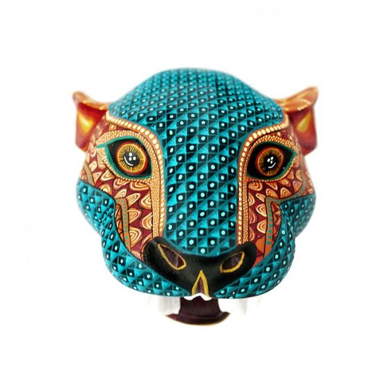
I chose to use a light blue/green colour for the mask, using jade masks and cut stones as reference.
The mask is one of the focal points for this character. I created it based off of the Jaguar. The jaguar was respected by the aztecs and they often created masks with animal features or in the image of the gods.

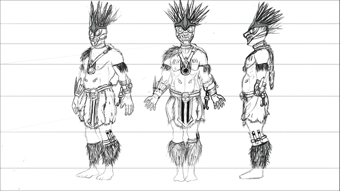
This is the final character turn around for my Aztec shaman. I drew the character as if I was sending it to a modeler. Using the basic stance that allows everything to be seen easily
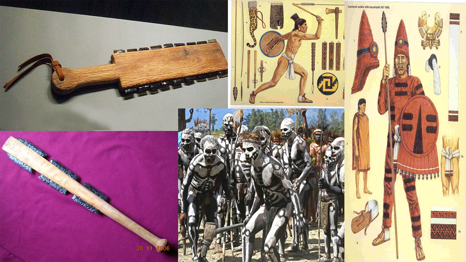
This is a mood board i used when creating the weapon.l There wasn’t much variation with the aztecs weaponry so i kept it simple and close to the real weapons they used.
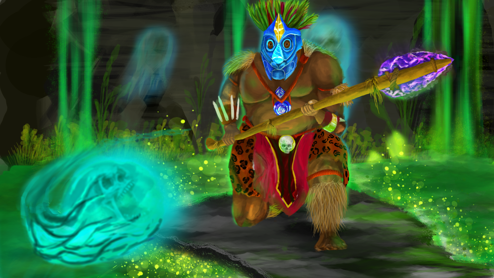
This is my final action pose concept art.
The weapon was created from looking at aztec weaponry and taking the aspect i liked to create a spear. The tip is purple obsidian because the aztec sacrifices were carried out with obsidian blades. The souls flying around him help show the fact that he is a shaman, conjuring magic from the dead.

Final turnaround

logo and branding research and development.
These are some logos that are used by animation studios, They are all very simple and clean. They can be scaled to any size and still be readable.
The Fonts used are easy to understand yet very distinguishable. This allows the consumer to know which company it is from the Font alone whether there is a logo or not.
I also looked at some logos that I thought didn’t work as well.


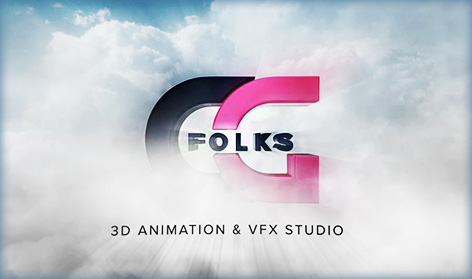
I did this so that I could learn from the mistakes these companies have made. I won’t be using any fancy colours such as the gold sheen effect on the ‘Animagic’ logo. The worst logo is the ‘CG’ folks one, i learned a lot whilst looking at this one. This is because you can’t understand what the company actually is, the name is covered by the clouds. The main focus of a logo doesn’t work.
The animation Studio I wanted to create would focus on animated shorts. I decided to stick to a name that was simple and effective. Deciding on ‘Short Studios’.
I began the design process by just sketching and seeing what I came up with.

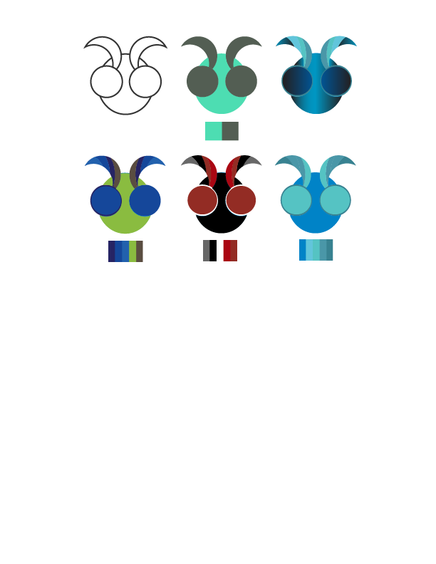
I really the liked the typographic style that i ended up with, and decided to test out some colour schemes and shorter versions.

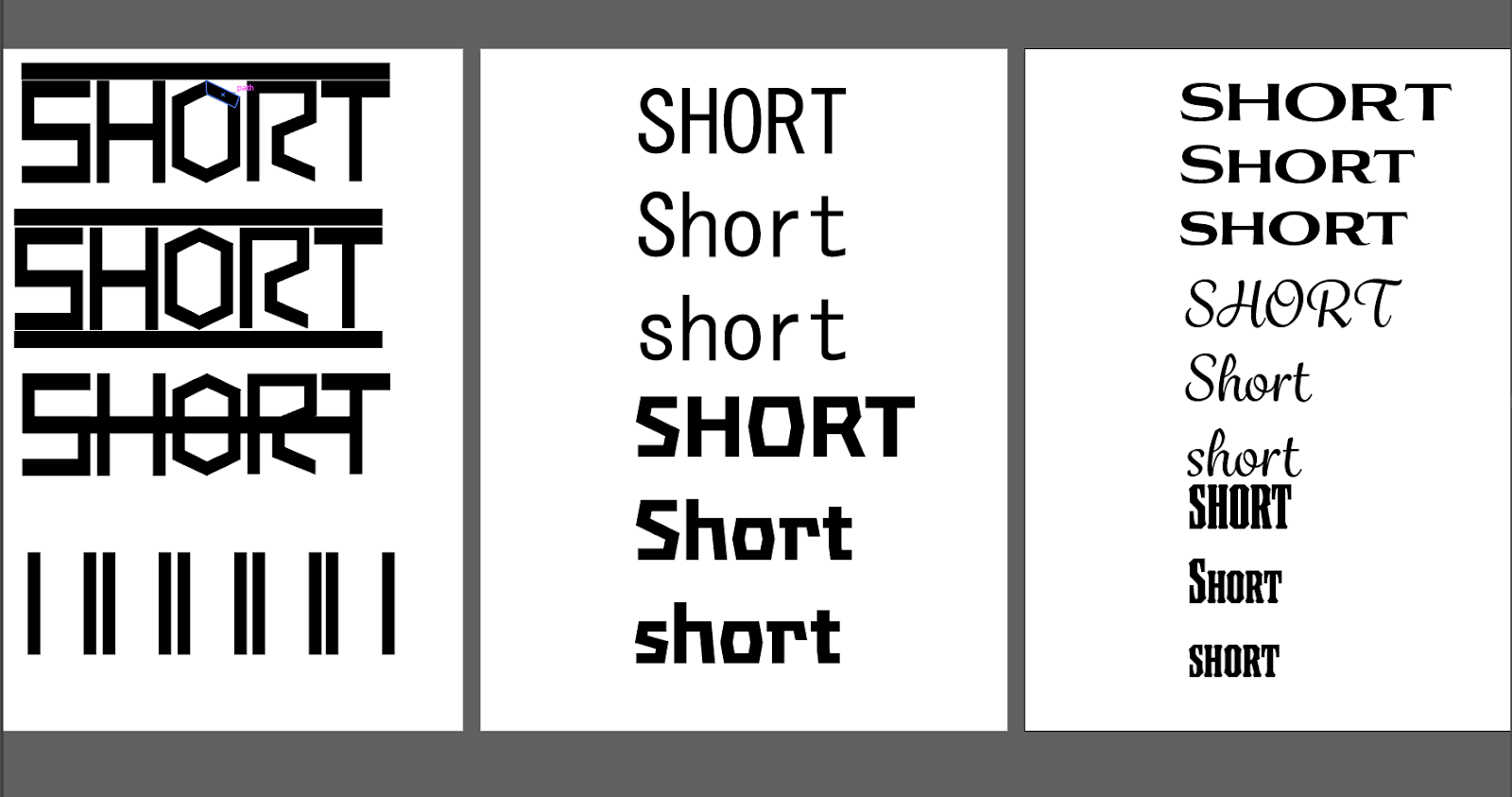
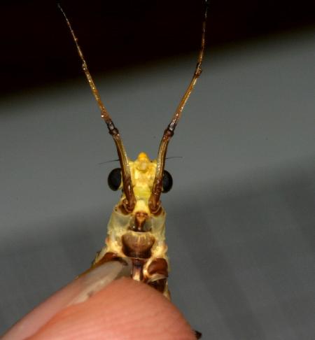
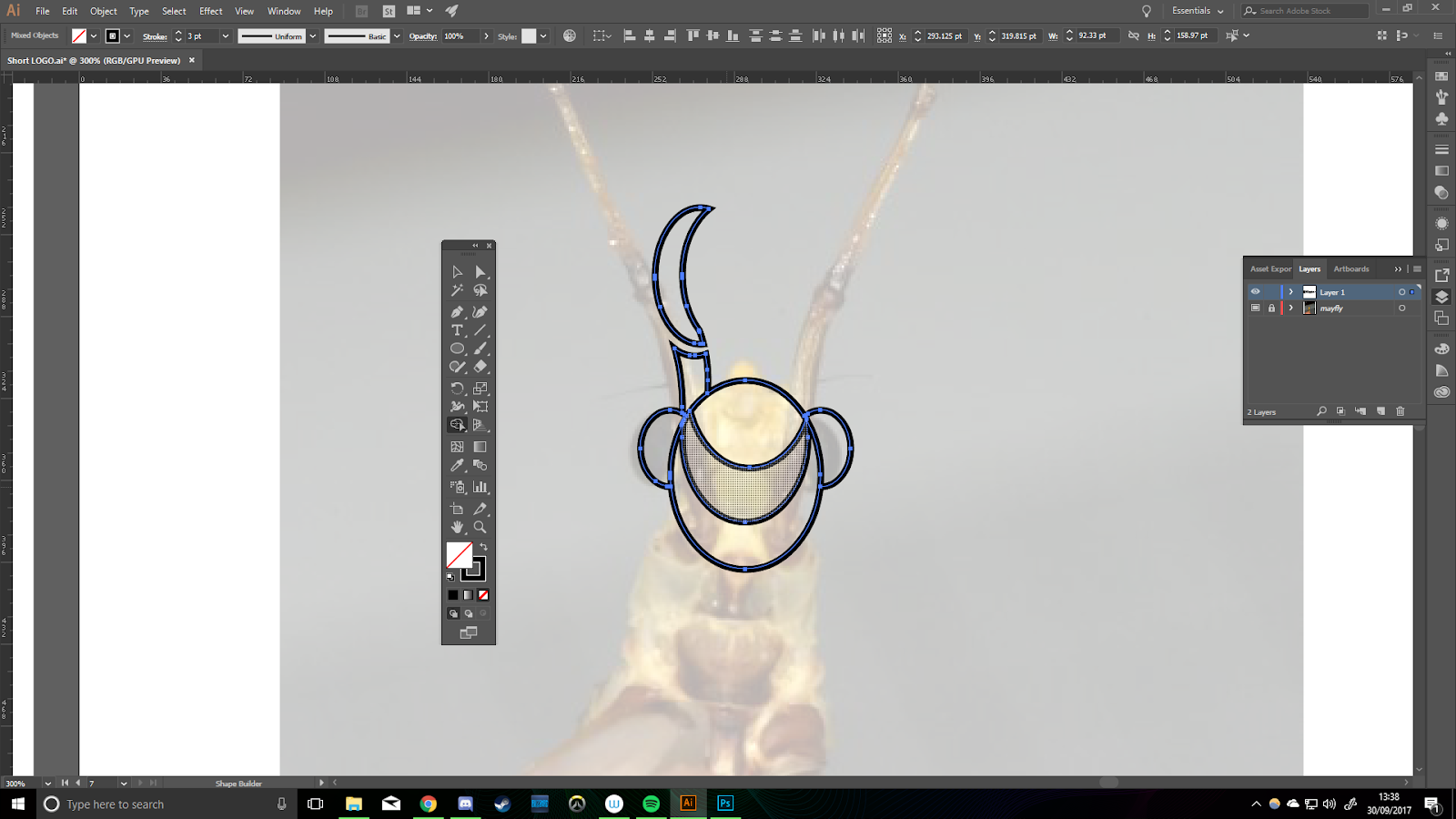
I Tested out a number of fonts, comparing them to each other and then searching for fonts with characteristics i liked. I then created a logo for the second idea. My idea was to stick with the name ‘Short studios’ but the logo was going to be a mayfly. This is because a mayflies life span is only 24hours, and the company focus on animated shorts.
I used this image of a mayfly to create my vector art.

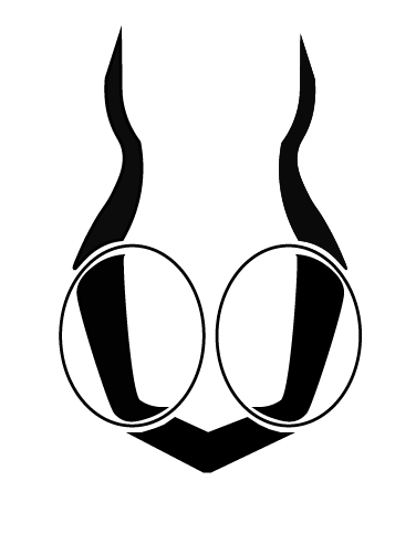
This was what I came up with, initially I was quite happy with this design. I asked a friend for their thoughts on the design and the first thing they said was that it looked like a female bra. After that comment I went back to the drawing board and created a few more iterations.
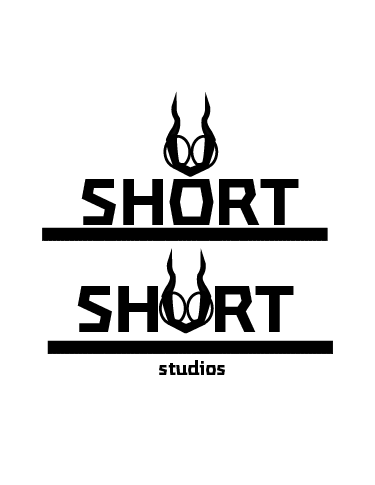
I liked swapping out the ‘o’ for the logo and decided to keep that aspect.
To help the creative process i gathered together some typographic logos into a mood board. That way I had some reference that could spark ideas whilst i worked.

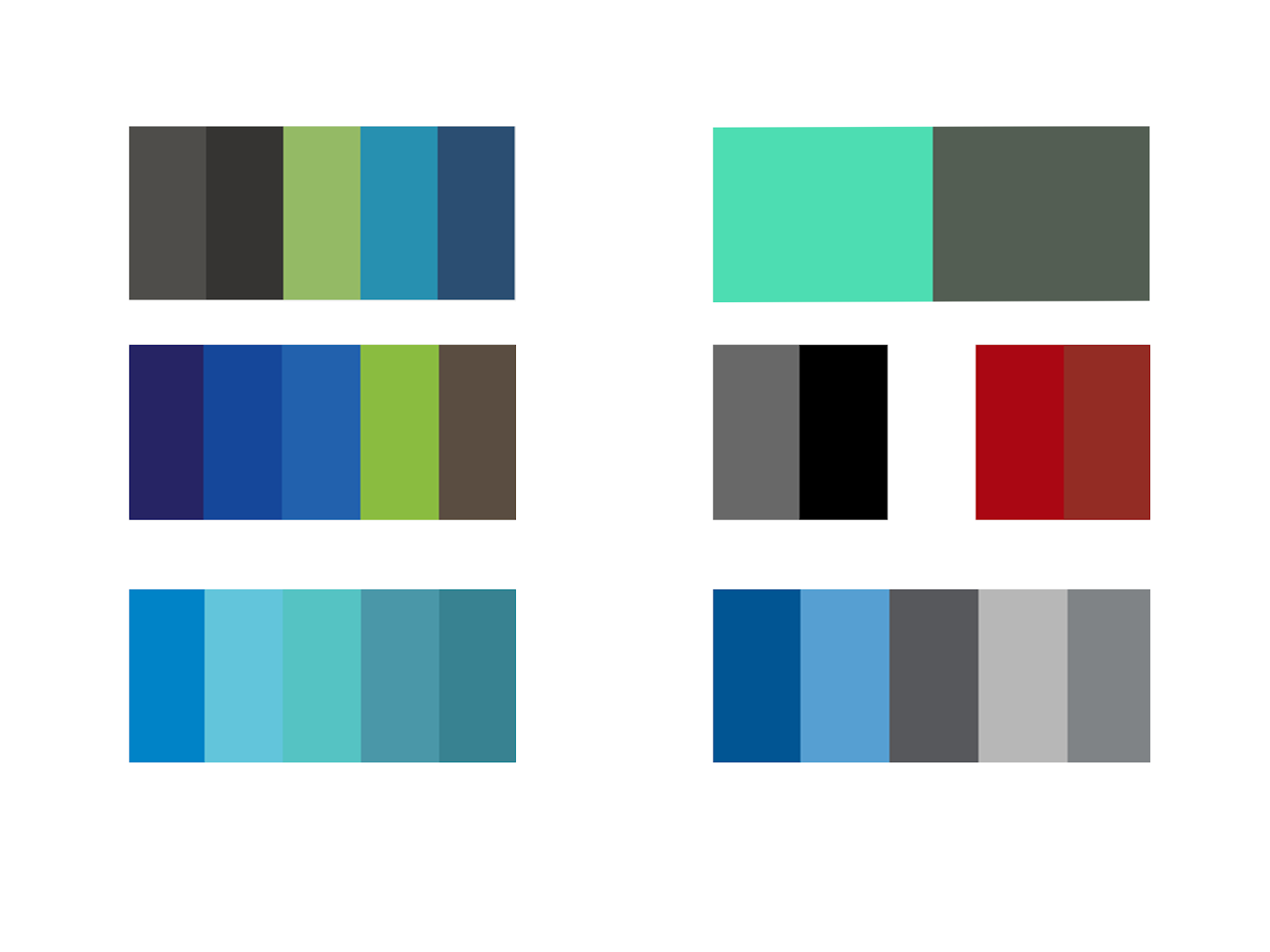
I also created a few colour swatches, using the colour wheel to come up with some interesting combinations.

Version 2
At this stage I knew i was getting somewhere but the logo was still not what I wanted.
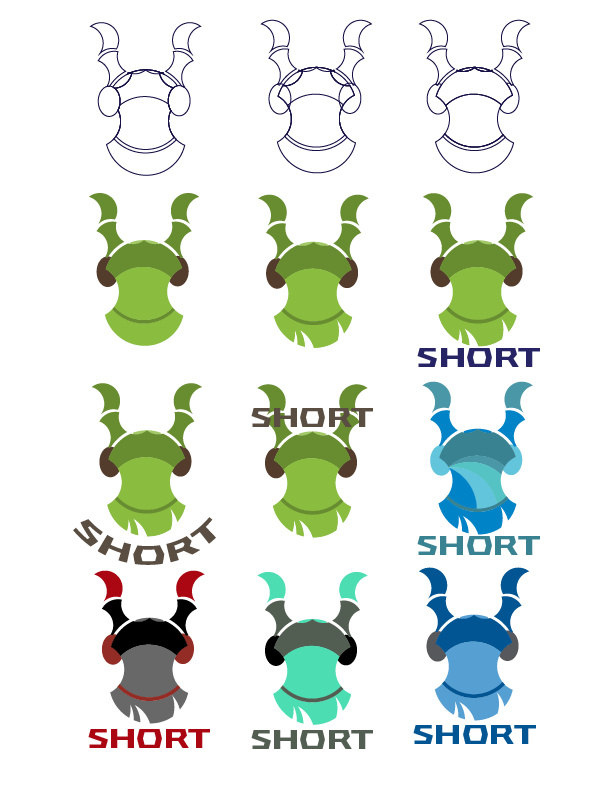
This logo turned out really well. I experimented with the colours and added some cut out grass shapes to the bottom of the logo. The green worked so well i decided to keep that colour scheme.
I then tested out some logo positions and added final touches to the logo until I had one i was happy with.

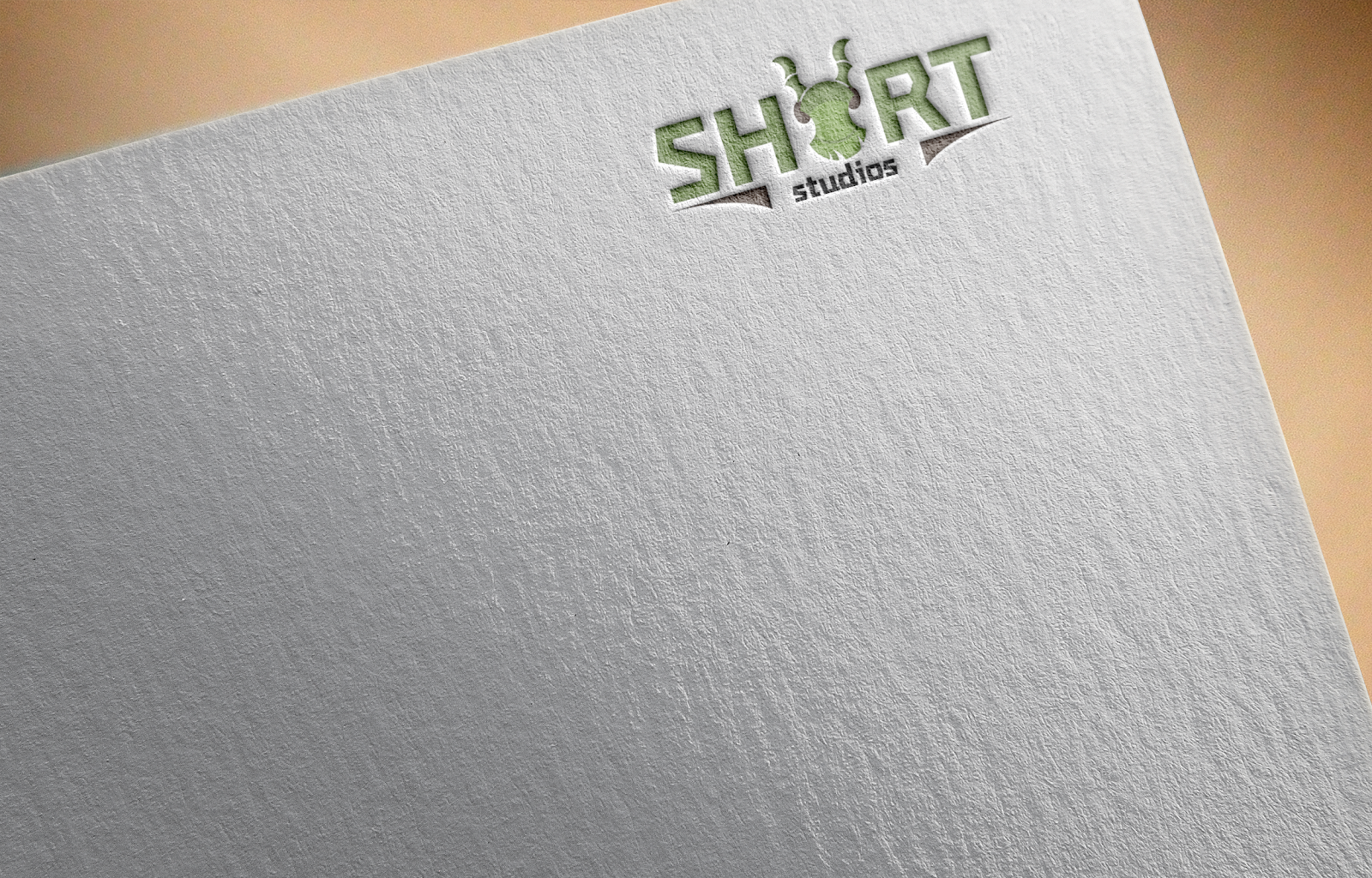
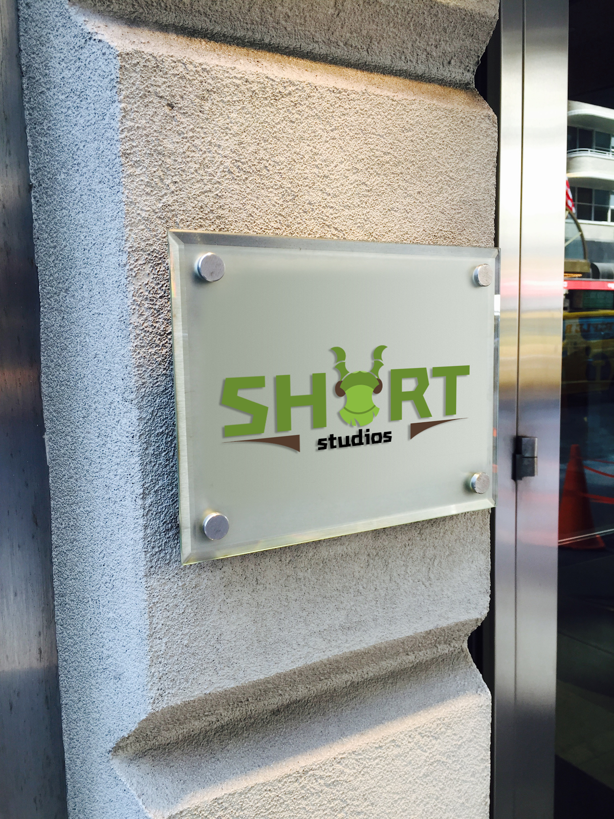
Final logo design

To make sure the logo was right I created a few images with the logo on. This gave me a visual representation of the logo in its finished format.

Web Banner
The next task I had to undertake was creating a banner for the short film I was creating. This took a lot of thought and I had to research film banners for quite some time before I could comfortably make start. Having not created anything like this before I tweaked it several times until I was happy with what I created.
I used Photos that fit the theme I was going for as I didn't have access to these sort of surroundings to take my own. I then used my Photoshop skills to edit and up the images into something I could use.

Reference images:

The Reference images really helped create an idea of what I would then create. I decided on going for a dark theme, quite de-saturated. Apart from a focal point of high contrast in the background.
This Is the banner I came up with After a lot of time spent re arranging and adding a number of images.

I added some colour correction to make the focal point a little more saturated. I also added Some yellow to the fog at the front and to the whites of the sky, in an attempt to bring the image together with an overall theme.

I spoke to a creative advertiser and showed him what I had created, to gain some feedback. He suggested that i make some positional changes, and align the text. Also added the same slight colour correction to the logo so that it didn't jump out so much, taking the eyes away from the focal points.
I also added some foreground elements to make the image look fuller, adding old pillars and some ruins on the floor in the foreground.

I put the banner on some images showing what it would look like on billboards.

 Launch party ticket
For the ticket I did some research on what these tickets would have to include based on ones I found online. I put the company logo quite large as this was not created to promote the film anymore and so the company behind it could be more noticeable.
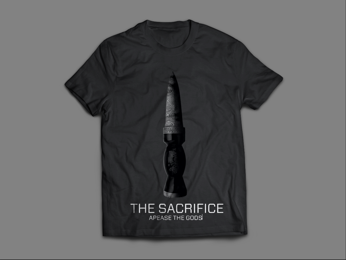
I chose a simple design with a main image being a sacrificial knife covered in fancy engravings as it fit the theme perfectly.
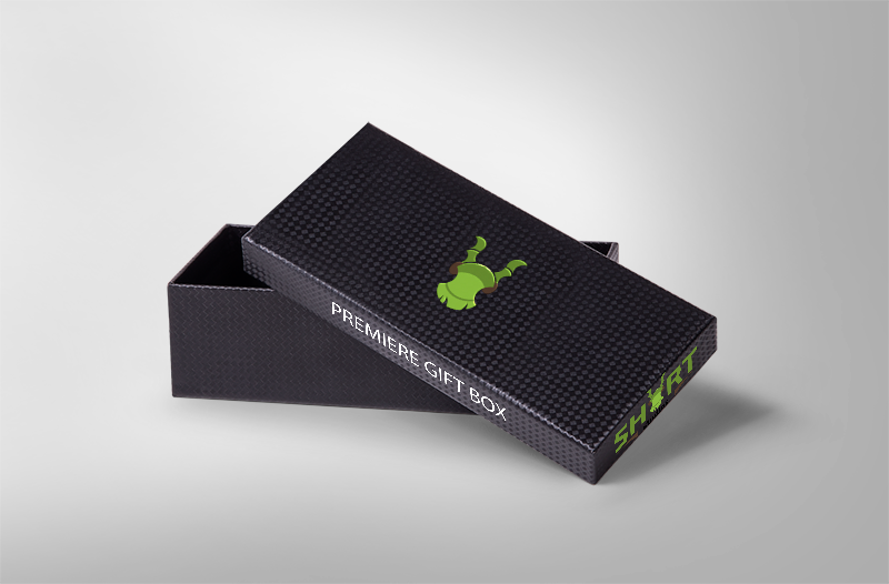
I decided to create my merchandise for Launch party attendees. This would be in a gift box given at the end of the event. The box would include a few items related to the company or the film. I decided to make a Badge, a range of t-shirts and a concept art book for the film.


The last thing I created was the storyboard for the opening scene to the film.


0 comments:
Post a Comment